Establishing an Enterprise Design System
Inspiring a team to create efficient, consistent, and accessible user experiences
Our Team
I led this effort in partnership with 5 designers:
Auditing and researching
Writing documentation
Creating variable components and tokens
I partnered with an Engineering Lead:
Education and implementation with engineering teams
Our Why
Product challenges: poor usability and accessibility, inconsistent behaviors
Team challenges: excess confusion, friction, and time spent creating or selecting components, typography, and color styles; No centralized source of truth or mutual understanding of how and why our enterprise products look and work the way they do
Product goals: Vibrent’s product mission is to be a reliable, sustainable, stable, and performant. Using an informed, well governed, enterprise design system targets this mission
Definition of success
This centralized design system will elevate design quality, product usability, and team and product efficiency, consistency, and accessibility. It will include detailed usage guidelines, and ongoing governance empowering us move quicker reducing cost and accelerating our time to market by reducing quality assurance issues and post deployment bugs
Discovery to Understand the Current State
Partner with an Engineer: Ensuring alignment and success
Audit resources and workflows: Confirmed variation
Designer files: Many files across XD, Figma, Sketch, and Photoshop; little parity, no formal usage guidelines, patterns, or tokens
Engineering files: Basic React Component Library that leveraged Google’s Material Design System; but, not all engineers used it
Awareness: Several team members across Design and Engineering didn’t know how to use a Design System so had to create it, create a process for using it, and educate the team.
Optimal next steps: Leverage Google Material’s Design System, purchase MUI to streamline our process reducing team effort and centralizing education
Convinced leadership: I aligned my presentation to our existing product principles and shared research validating potential efficiency and financial gains. Once approved, I managed the MUI purchase and seat assignments for Engineers since I was managing all software licenses across the design community
A screenshot from the presentation I created to convince leadership – showing just how many different versions of similar colors that lived across the product
Establishing Guiding Principles
Efficiency
Respect our users' time by streamlining workflows empowering them to work smarter and faster.
Consistency
Honor our users' cognitive capacity by maintaining predictable patterns enabling them to act intuitively and confidently.
Accessibility
Value all users equally by designing inclusive experiences that accommodate diverse abilities, contexts, and distractions.
Defining a Process
Laying the foundation and cross-functional alignment
Highest user and team impact: Initial changes would include:
Styles: Typography and icons (font awesome) and color
Components: Buttons, alerts, modals, form fields, and tables
Designers were required to link the design system file to all working files and share updates in real-time to keep links up to date
Designers would start by searching engineering’s component library:
If a component existed: Designers update files to match and informs team
If a component existed but needed clarity or changes: Designers send the library link to our Engineering Partner to discuss next steps which included; but were not limited to:
preparing an audit guide so eng. knew what to replace
documenting usage guidelines based on best practice research ensuring alignment with guiding principles; details include behavior patterns and anatomy details
updating the component including all variable properties and tokens, and share with engineering via Zeplin
If a component didn’t exist: Let our Engineering Partner know we want it and decide if should be a snowflake or if it will be added to our design system then follow the steps above to create it
Snowflakes: Leverage atomic design framework to maintain organization and naming conventions; research, create, and share details with the team
Changes: Rolled out with each new feature or enhancement
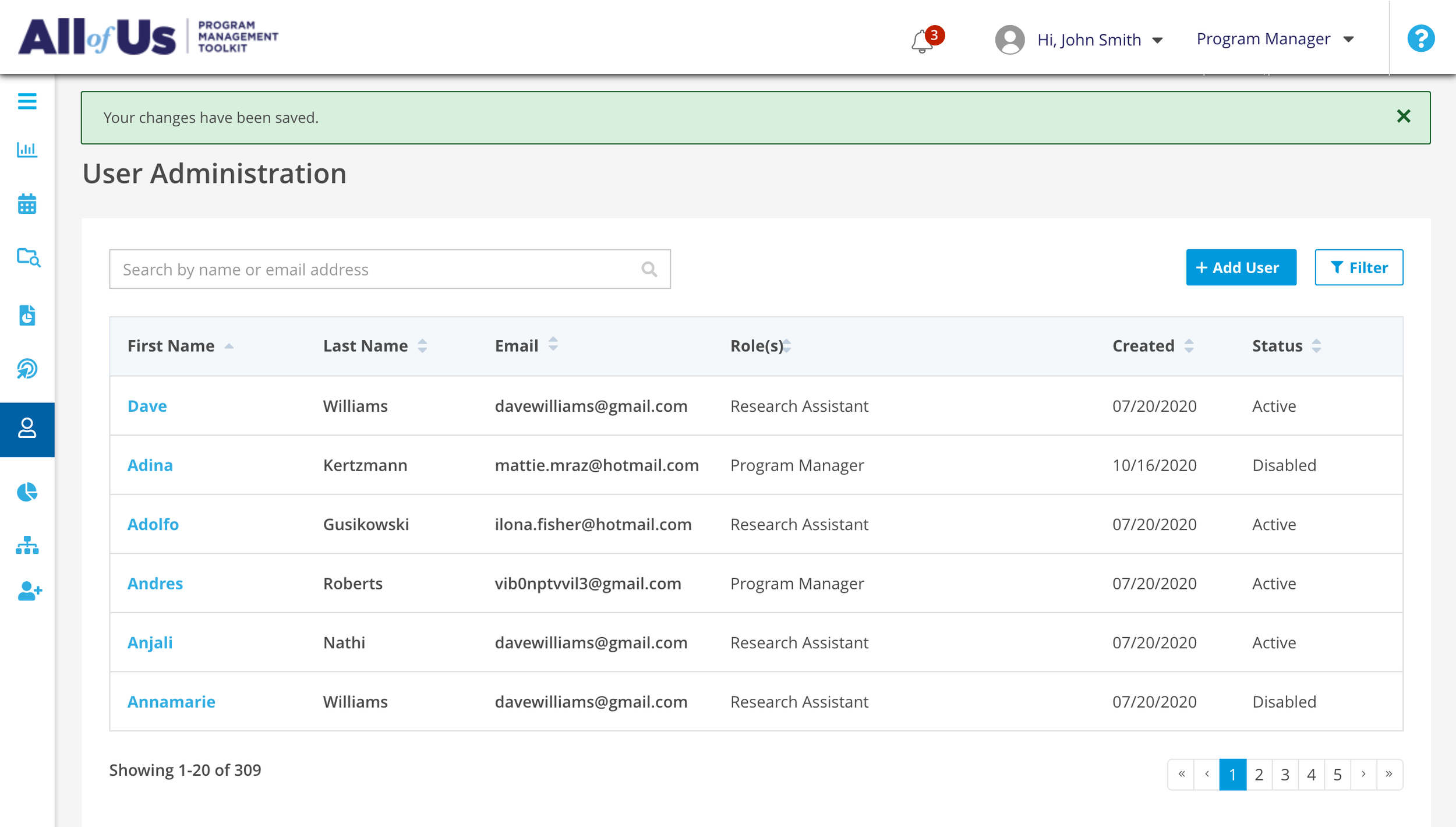
Audit Guide Example: Explaining color changes to engineering by clearly defining the correct and existing colors so they knew what to replace in their code
Setting our Type
Guiding users with legible, accessible copy
We selected the most widely used font and assigned seven core styles across four categories: Headings, Body, Buttons, and Captions. We assigned a type scale that added clarity and governance outlining how, when, and why to use it
Selecting a Font Family
Defining the type scale and line height guidelines
All Type details listed and categorized by use case for usage clarity
Before – Inconsistent sizes, legibility given visual competition with links
After – Uniformity and consistency given links hierarchy
Choosing our Colors
Guiding users with accessible, systematic palette
We aligned our color system to our brand guides to build brand loyalty. We ensured WCAG color contrast for accessibility. We added clarity and governance by outlining how, when, and why to use them. We leveraged a third-party tool to name the tokens.
Applying color contrast
Neutral, accessible backgrounds
Variable, accessible data visualizations sets
Scaled button system
Before – Visually challenging to understand activity and availability
After – Clearly denoted availability, emphasis on activity and structure
Adjusting our Alerts
Guiding users with clear, descriptive notifications
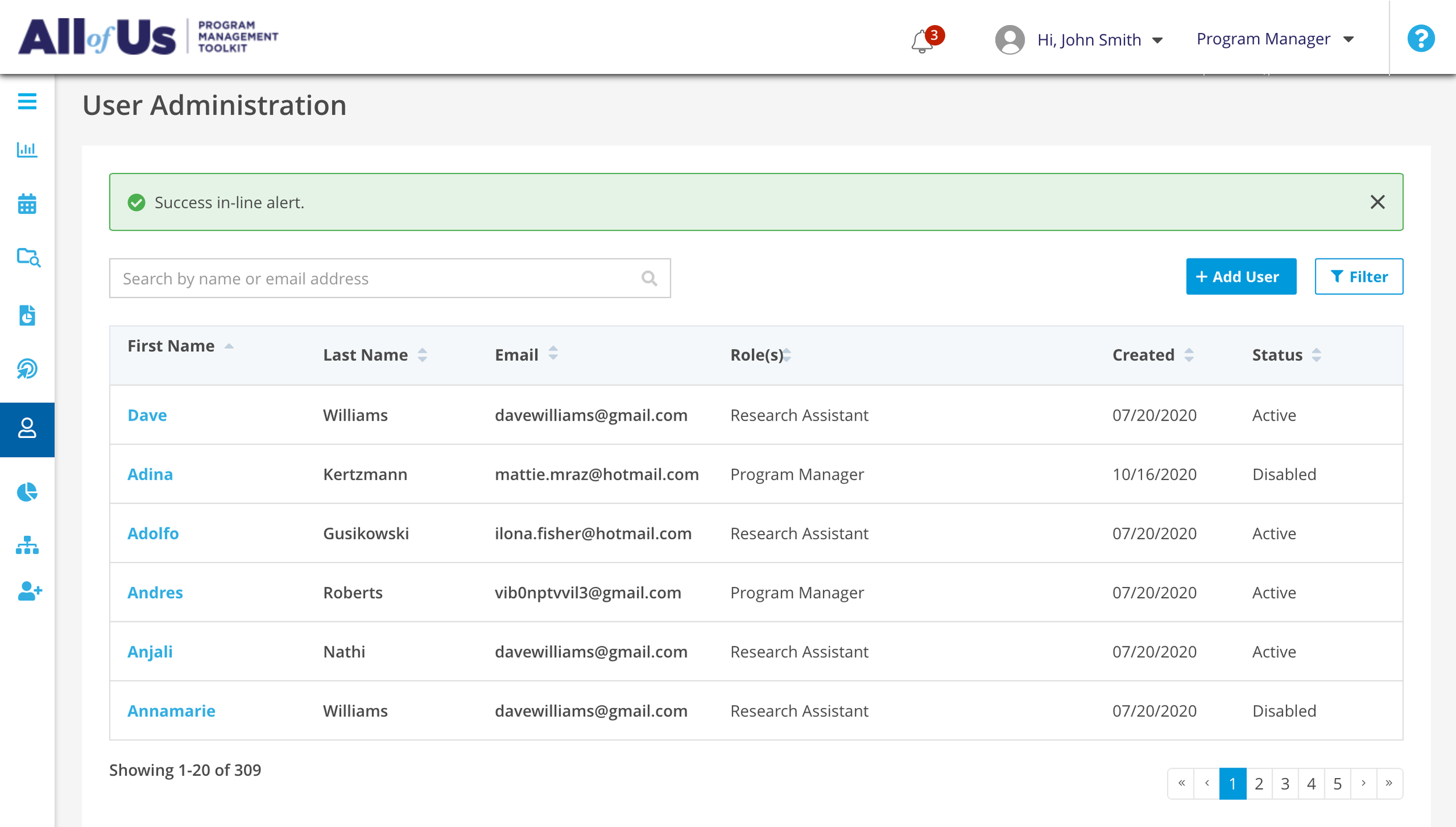
Possibly our most valuable, common, and inconsistent components. We aligned on style, placement, animation, and copy guidelines with clear before and after examples.
Explaining the purpose and usage patterns
Explaining interactions and accessibility
Articulating usage and copy patterns
Before – Uncertain context, disoriented transition to the top of the page
After – Contextual supportive, descriptive insights
Before – Competing icon color contrast; Inconsistent, unclear color usage
After – Consistent clarity emphasizing caution and context
Building our Toolkit
Buttons, icons, form fields, modals and more
We prioritized the most common elements and slowly implemented changes based on research.
Leveraged most common existing patterns to maintain current user bias and expectation with consistency
Leveraging atomic design labeling, scaling emphasis for specific standard or prominent actions
Outlining all possibilities for form fields
Outlining dropdown variations
Explaining complex consistency in modals
Tables that focus alerts and actions
Outcomes
Collaboration: Streamlined alignment between Design, engineering, product, and quality assurance partners
Decreased Bugs: Caught before and after deployment
Accelerated Delivery: Enabled us to go-to-market faster
Improved Accessibility: Components were AA WCAG compliant
Elevated quality: User testing suggested improvements in usability and Go-To-Market team applauded brand loyalty
Reflection
Dissemination: Reading async wasn’t ideal; could host presentations in routine meetings cross-functional teams
Cloud: Migration slowed us down; could have started here
Copy Guidelines: Alert and button copy guidance was helpful so we could have templatized other areas to encourage contributors
Metrics: It was challenging to articulate the value of time spent to leadership; could establish a report for reduced QA tickets and post-deployment bugs, components created, and team feedback


