Partner CMS
Reimagining a CMS Product
Empowering Health Researchers to educate and recruit study participants using their own websites, landing pages, and webforms to generate leads

Our Team
Core Team:
I was a player coach, overseeing 2 designers at various stages
2 Product Managers over the course of the project
Offshore engineering team
Additional Contributors:
Design agency who created website templates that lived inside the CMS
Timeline:
~4 months to fully redesign and build as development was happening in parallel with design
Our Why
This project was ambiguous, highly visible, and time sensitive
Business goals: Increase user adoption and retention. Indicators included increasing the number of active users and comparing it to the number of websites, landing pages, and webforms saved vs published. Work within drupal to maintain security compliance
Enterprise user challenges: Health researchers used these sites to educate and recruit participants into their health studies. These health study staffers are not trained content/web marketers so they didn’t know how to leverage these capabilities for lead generation. They lack confidence in our tool because they are unable to easily find their content and struggle to make changes or provide approvals
Our goals: Identify and relieve challenges to provide an intuitive, user-friendly web builder for our users to create, edit, and approve websites, landing pages, and webforms to effectively collect leads and filter them into the Program Management Toolkit for follow up. Streamline future maintenance by aligning design systems
Research and Discovery Overview
To understand, empathize and define success
User feedback: I gathered insights from watching advisory board recordings and talking with Customer Success and PMs who connected with users
Audit product: I mapped the current experience to identify enhancement opportunities
Competitive analysis: I created accounts with other tools (Squarespace, Wix, and Wordpress) to identify industry standards and potential user expectations
Define scope: I partnered with my PM to align business, product, customer, and user goals, clarify our scope and baseline requirements, technical limitations, terminology, and timeline
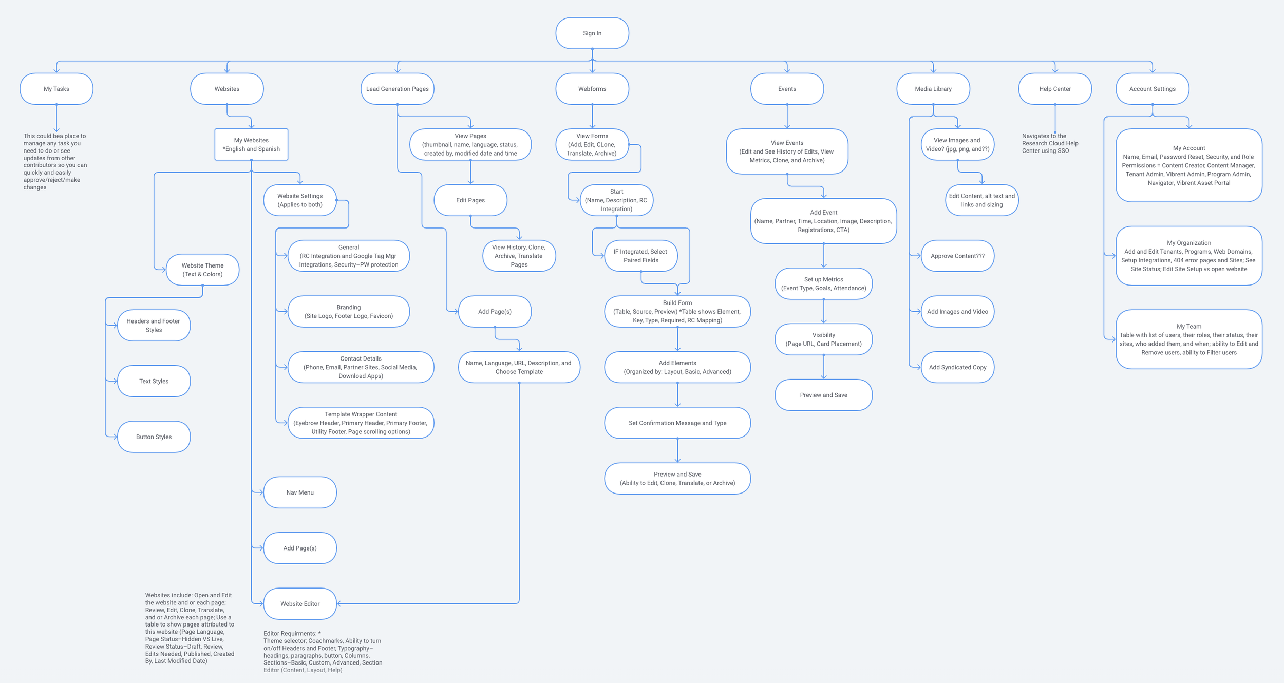
Revised user journey: Reorganized the site to surface content differently and shared an information architecture diagram with engineering iterating it to align with technical constraints
Our definition of success:
Provide consistent, intuitive navigation
Integrate with an API for the visual in-line editor that works with Drupal
Streamline the saving and approval workflow, highlighting changes and attribution
Provide at least 1 website template for our users as a guide to get them started
Include contextual helper/how-to insights within the site editor
Integrate with our other enterprise tool, Research Cloud, so qualified leads can be used in campaigns and case lists
Obtain enterprise product alignment by leveraged our Enterprise Design System
Initial Product Audit
Created a user and built a website. Created another user to approve changes. I instantly related to our user’s confusion and frustration.
Key Findings:
Inconsistent navigation; 3+ nav menus; challenging to return to the site/page created
Inability to visualize the page you’re editing when making changes
Difficult to understand the approval process when making changes
Blank pages gave too much freedom for our novice users to create their websites; no guidance or helper text
Inconsistent branding, no design system or enterprise product alignment, little hierarchy of information, inconsistent messaging, unclear terminology, unnecessary content in some places; ignores all accessibility standards
Initial top level navigation assessment showing how many menus existed and how each menu and page was so different.
Designing, Testing, and Building
Ideating, prototyping, and testing
Created and iterated low-fidelity designs based on internal team feedback and technical limitations. Revised the sitemap respectively.
Iterated mid-fidelity designs based on internal team feedback and learned technical limitations so we had to revise the sitemap because our original site organization wasn’t going to work due to our tech stack so we had to pivot and restart quickly.
The Product Owner met with stakeholders throughout the process to collect user feedback, gaining approval and excitement and we maintained internal, collaborative peer reviews, iterating as needed.
We shared screens with our offshore engineering as we were creating them, using Zeplin, and collaborated in weekly meetings and regularly over slack, iterating the designs as we gathered information.
Revised Information Architecture Diagram
This sitemap helped us understand the technical limitations caused by using Drupal and integrating with Acquia Site Studio – aligning our team’s expectations, guaranteeing what we design can be implemented. View Sitemap in FlowMapp
Key Takeaways:
Website Settings, Theme, Navigation, and Site Editor must be separate from one another
WebForms and Events can not be part of the Content Library; they must be separated, like Lead Generation Pages
Syndicated copy is not part of MVP; but site templates will be created by an outside vendor
Account setup and user admin happen in a different enterprise product
Editor changes are the only things that go through an approval/review cycle
The initial site is configured by a System Admin before Content Creators see it

Created in FlowMapp, previous iterations created in XD where we attempted to arrange content differently.
New Designs
Website Builder:
(Acquia Site Studio)
The integration enabled our users to drag and drop directly onto the page enabling our users to visually see their changes from the drawers shown, giving them confidence in each edit.
We included a “help” section sharing web best practices so our users can learn how to create content, giving them the power of a health research marketer.
Website editor: Technical limitations with the Acquia integration for this feature forced us to leave the initial navigation menu; however, we offered two ways for our users to leave the editor.
Website editor with an open ‘component’ drawer with drag and drop a ‘text component’ onto their website. We provided custom component blocks based on templates.
Text editor drawer for editing content within a component. We let our users make changes here before they are added to the site. This was role based. Approval was required before changes could be published to the live site.
Text component editor for layout and style to adjust spacing, columns, etc.
Text component editor for help to guide our users through the website creation process.
Website Sign in and Setup
Divided into 4 sections, we called this Website Setup because it encompassed site specific information that could vary if our user had bilingual websites. Throughout each step, we included helpful tips and best practices to teach our users how best to represent themselves.
Sign in: We leveraged the Sign in look, feel, and functionality from another product to emphasize our enterprise branding.
General Settings: for integrations and analytics details. our users could integrate with our other tool, Research Cloud, to capture lead generation information to recruit prospective participants.
Branding: for logos and the site’s favicon that populate in the template wrapper and other places throughout the site, based on the template selected
Contact Details: to populate throughout the website from a central place
Template wrappers (header and footer content): allowing our users to customize universal content. Learned toggles are instantly saved, not typically paired with save.
Website Theme
Themes apply universally to both English and Spanish websites. We called this “theme” because it changes the overall look and feel of the template our users selected and we’ve separated in 4 sections, Header, Footer, Text, and Buttons.
Theme, header styles: Each template has default styles or they could opt to customize them.
Theme, header styles: Showing if our users opted to customize them.
Theme, footer styles: Showing if our users opted to customize them.
Theme, text styles: Showing if our users opted to customize them.
Theme, button styles: Showing if our users customize buttons. Color popups were recommended but could not be implemented.
Website Templates
After the website is configured, the System Admin or Content Creator can select a template of their choosing. These templates provide an outline for our users to start from, so they can tell their best story. Each template had their own design system and were strategically crafted to showcase health research content. Templates were created by other designers on a different team; however, the design system was created by us to align with engineering.
Template selector: We labeled the templates with prominent names in health research; Lawrence A Tabak is the current director of the NIH which is our largest customer. Dr. Jonas Salk developed the vaccine that eradicated polio. John Snow is considered the founder of modern epidemiology.
Website editor with template: Shows how the editor looks and responsiveness of the website.
Website template design system: Showing colors
Website template design system: Showing typography
Lead Generation Pages, WebForms, and Events
Researchers used lead generation pages to gather information from and recruit prospective participants to join their research programs. Since these pages require additional campaign analytics and were essentially one off sites focused on specific events, they were separated from websites; however, both utilized the same site builder and had their own set of templates. WebForms could be used here or on websites.
Lead gen page details: shows a preview of the page with its’ revisions and approval history, and if there are any web forms or events linked to this page.
WebForms step 3 of 5 (build): We had grand ideas for how to use the editor for this; however, technical constraints and implementation delivery timelines limited us to leveraging a more familiar table format.
WebForms step 3 of 5 (build): Leverages a similar drawer functionality reminiscent of the web editor, for our users to add content to their forms.

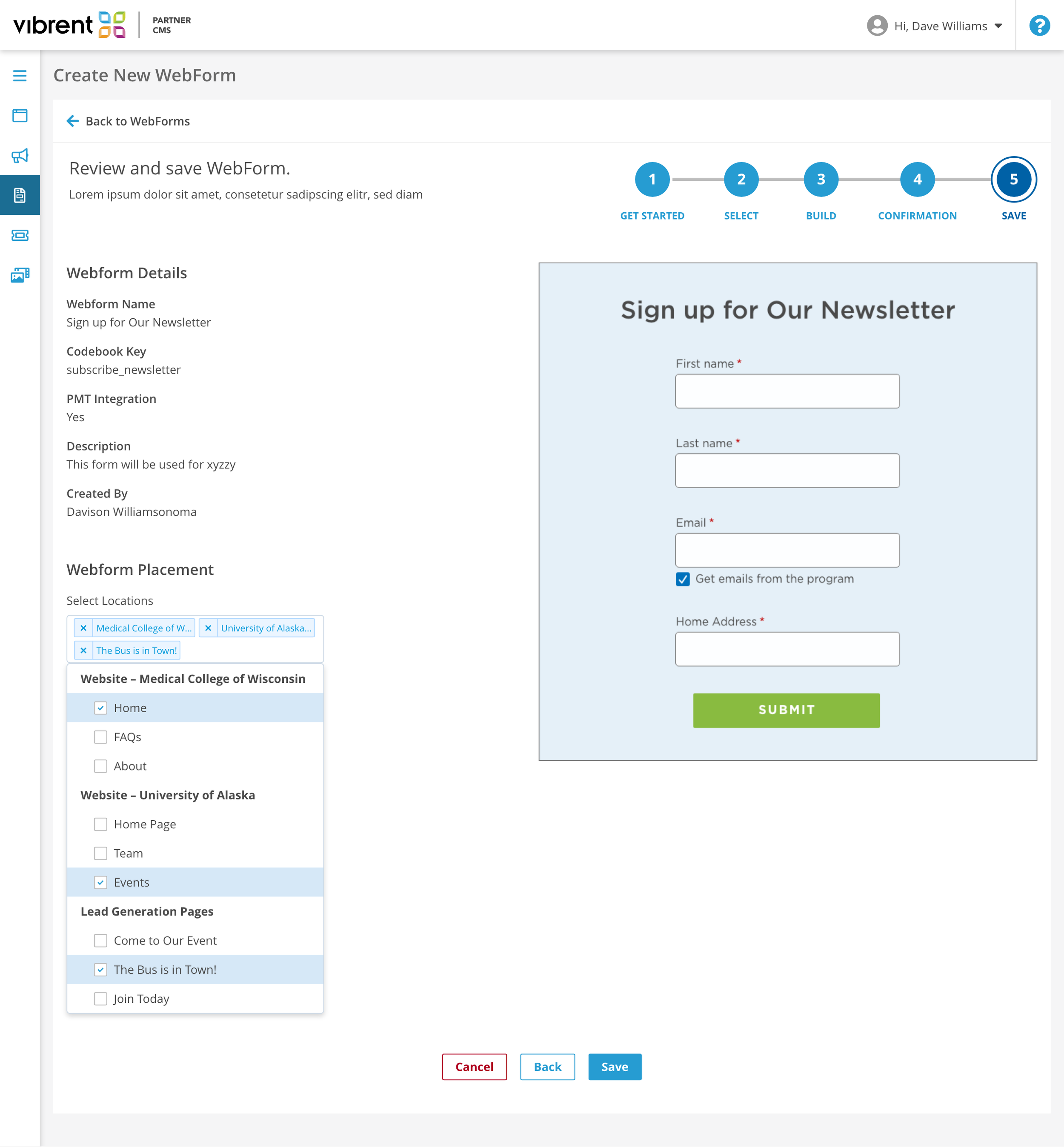
Webforms step 5 of 5 (save): This was an opportunity for our users to review the form and ensure accuracy of the information they input before linking it to a webpage.
Events step 1 of 4 (set up): This step defines their primary event details to create an event card and or event webpage.
Outcomes
Impact: We met out goals! Users were more confident in the tool; validated by increase in active users, task completion of saves and approvals, leads collected, and campaign activity in the enterprise tool
Consistency: The enterprise product suite was easier to maintain and update now that we leveraged our design system
Partnerships: We built long standing relationships with the design contractor and creative agency who helped bring this to life
Reflection
Collaboration: The Product Trio are more effective when we have open conversations to ensure shared understanding early on as this could have prevented misalignments; Example: the product architecture needed to be revised causing a delay during this project
Aligned tools: with all contributors to ensure follow up and editing
Product Templates: Offering site and form templates for smaller research studies would benefit other clients as not all research studies are as complex as our primary customer
Metrics: I could have followed up on analytics dashboards to measure success of changes overtime
